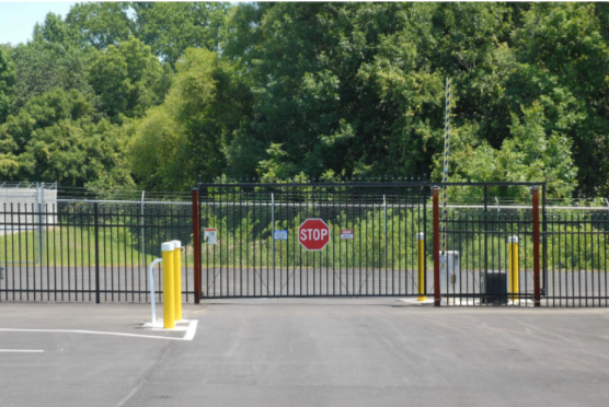
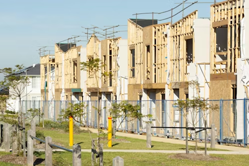
Why Multifamily Projects Benefit from Commissioning
Multifamily buildings has become a more important topic because clients are asking better questions about comfort, cost, compliance, and long-term building quality. Whether the audience is developers and property managers, the value of this topic grows when many suites and common systems need to work together. In real projects, commissioning reduces drift between design intent and lived experience. That is why people who are trying to improve performance usually benefit from a more practical understanding of commissioning for multifamily buildings, not just a surface-level definition. In many cases, the best results come from slowing down just enough to understand what…